
A kick-butt logo design is of great importance to any business. Often seen as the first impression of a company, its logo must be tailored to communicate specific values and ideals in an instant.
However, logos not only have the look good, they should also be thoughtfully designed and capable of taking on a variety of uses. This could include being scaled to a range of sizes, being reproduced in flat color and being printable on paper stock. In this post we look at 30 contemporary examples of great vector logo design and find out what makes them work.

1. Castle Print
The Castle Print logo by Sean O’Grady creates a strong and immediate connection to the nature of the business it is designed for. By basing the graphic on the Subtractive Color Model the logo not only relates directly to the printing industry, but also creates a unique mark by reflecting the company name (‘Castle’) in the form of a castle icon shaped from the blending colors.
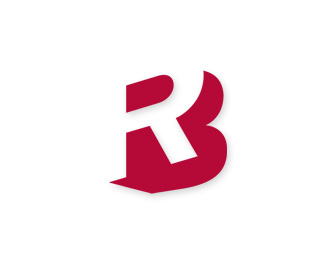
2. Ryan-Biggs
Bryan Kahrs use of negative space on the Ryan-Biggs logo gives a fantastic illusion of the letters B and R, initials of the targeted company while the slight angle adds depth and dimension to the design. All expressed in a single colour making the logo adaptable for a variety of uses and contexts.

3. One Leaf
The One Leaf logo by Choerte combines imagery directly generated from the business name into a single graphical mark. The numeric version of the word ‘One’ is used as a tree to accommodate the simple leaf graphic. Both relate directly to the business name, as well as to the type of business. The two are also combined perfectly giving a nice smooth flow.

4. Greener
The Greener logo by Tanner Christensen gives a modern impression with varying weights of sans-serif type, but also adds the impression of multiple layers without risking the logo’s ability to be reproduced in a single color (always an essential aspect of good logo design).

5. Talkmore
A fine logo design for talkmore uses symbology in the form of quotation marks to replace the letters A and E, creating a clever image that gives a graphical representation of the words and meaning of the brand. The touch of color enhances this effect making the logo stand out and adding to its attractiveness.

6. Black Sparrow
What first appears to be a simple design, the Black Sparrow logo from Alex Wende turns out to have some extremely high attention to detail. Everything from the bird icon to the type is tweaked with slight curves and flowing lines pulling together the complete design into a unique and effective branding statement.

7. Swannie Lake
The Swannie Lake logo from Savera+Co blends the modern sans-serif typeface Avenir with a sleek graphical image than not only fits perfectly with the logo but also adds a subtle touch to the design.

8. Elara Systems
Using soft curves in the type and graphical device gives a friendly appearance to the Elara Systems logo by Maximalist. Bringing in the use of modern trends in the form of three dimensional effects to create a modeled letter E in the design fits perfectly with the animation and modeling studio this logo was created for.

9. Onwine
Perfect type choices and a superb idea from Piotr Chrobot give a sophisticated image for the Onwine logo, pulling together graphical imagery and type to produce a unique mark that brilliantly conveys the topic of the brand.

10. Popp
Vlastmil Svoboda’s design for the Popp logo takes the idea of basing a design on type to the next level by creating the complete word from the single base shape. The letter O can be seen repeated on every letter, with small tweaks made to the letter P to differentiate and give legibility to the word.
However, logos not only have the look good, they should also be thoughtfully designed and capable of taking on a variety of uses. This could include being scaled to a range of sizes, being reproduced in flat color and being printable on paper stock. In this post we look at 30 contemporary examples of great vector logo design and find out what makes them work.
1. Castle Print
The Castle Print logo by Sean O’Grady creates a strong and immediate connection to the nature of the business it is designed for. By basing the graphic on the Subtractive Color Model the logo not only relates directly to the printing industry, but also creates a unique mark by reflecting the company name (‘Castle’) in the form of a castle icon shaped from the blending colors.
2. Ryan-Biggs
Bryan Kahrs use of negative space on the Ryan-Biggs logo gives a fantastic illusion of the letters B and R, initials of the targeted company while the slight angle adds depth and dimension to the design. All expressed in a single colour making the logo adaptable for a variety of uses and contexts.
3. One Leaf
The One Leaf logo by Choerte combines imagery directly generated from the business name into a single graphical mark. The numeric version of the word ‘One’ is used as a tree to accommodate the simple leaf graphic. Both relate directly to the business name, as well as to the type of business. The two are also combined perfectly giving a nice smooth flow.
4. Greener
The Greener logo by Tanner Christensen gives a modern impression with varying weights of sans-serif type, but also adds the impression of multiple layers without risking the logo’s ability to be reproduced in a single color (always an essential aspect of good logo design).
5. Talkmore
A fine logo design for talkmore uses symbology in the form of quotation marks to replace the letters A and E, creating a clever image that gives a graphical representation of the words and meaning of the brand. The touch of color enhances this effect making the logo stand out and adding to its attractiveness.
6. Black Sparrow
What first appears to be a simple design, the Black Sparrow logo from Alex Wende turns out to have some extremely high attention to detail. Everything from the bird icon to the type is tweaked with slight curves and flowing lines pulling together the complete design into a unique and effective branding statement.
7. Swannie Lake
The Swannie Lake logo from Savera+Co blends the modern sans-serif typeface Avenir with a sleek graphical image than not only fits perfectly with the logo but also adds a subtle touch to the design.
8. Elara Systems
Using soft curves in the type and graphical device gives a friendly appearance to the Elara Systems logo by Maximalist. Bringing in the use of modern trends in the form of three dimensional effects to create a modeled letter E in the design fits perfectly with the animation and modeling studio this logo was created for.
9. Onwine
Perfect type choices and a superb idea from Piotr Chrobot give a sophisticated image for the Onwine logo, pulling together graphical imagery and type to produce a unique mark that brilliantly conveys the topic of the brand.
10. Popp
Vlastmil Svoboda’s design for the Popp logo takes the idea of basing a design on type to the next level by creating the complete word from the single base shape. The letter O can be seen repeated on every letter, with small tweaks made to the letter P to differentiate and give legibility to the word.


